
For my Unit project, I was originally going to do something different but I liked the satire of political leaders a bit more. For my project I wanted to imagine what would the Earth’s president look like if we had one.
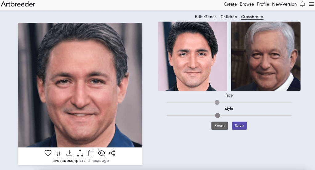
Before I started using any ML tools to process images I had to determine how to give weight to countries and in a sense power. To do this I looked at each continent/region’s nominal GDP. At first, I wanted to use inflation-adjusted GDP but I couldn’t easily find it for all countries. Doing this I then found the top 4 GDP’s of each continent and merged their political leader’s faces using the Artbreeder tool. When doing so, I adjusted their features to be mixed according to their GDP; the more dominant the GDP (I made a percent of the country’s GDP compared to the continent’s GDP) the more dominant the features. (link to the google sheets)
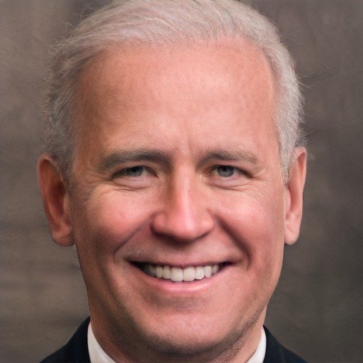
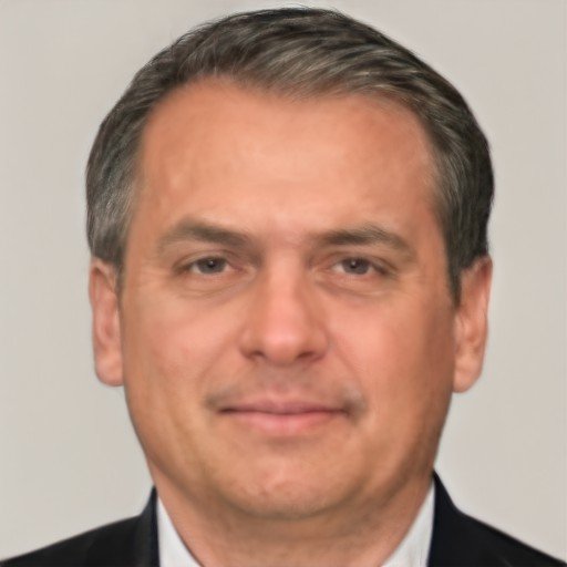
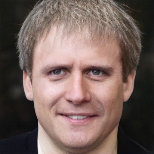
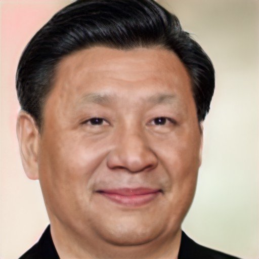
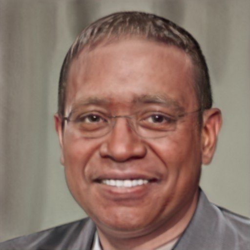
From top left to bottom right, we have Presidents of North America, South America, Europe, Asia, Africa, and Oceania. However, when looking at the portraits we can recognize some similar faces, someone, as China’s president or the US president. Using the idea that more “dominant” countries’ traits carry over, I was greatly curious to see how the world president would turn out.
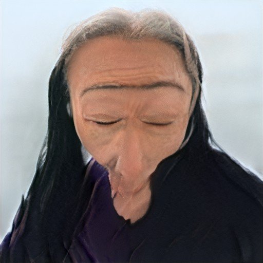
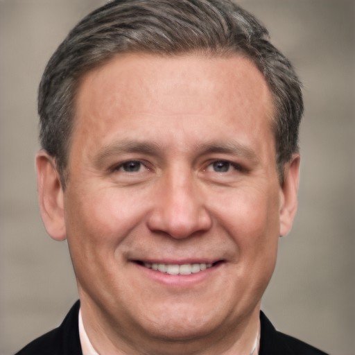
Similarly to the last step, I created a percentage (continent GDP to world GDP) to compare countries when mixing their features. This resulted in the final two faces, before the world president.
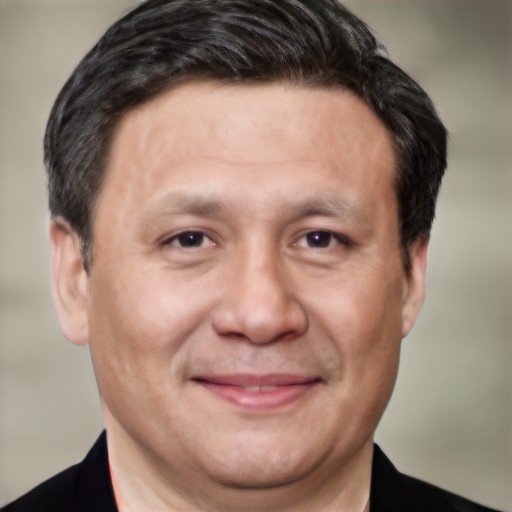
Left to right we have the president of the Americas and Oceania, then the president of Eurasia.
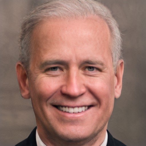
Lastly, using the previous idea I used the summed continental GDP over the world GDP to compare their “power” before getting a world president.
Overall I was pretty pleased with the portraits, but I wish I could have spent more time using Photoshop to create the graphic. I struggled to make the barebones graphic and used a lot of time processing, uploading, and gathering data. I had planned to add flags to the sides of each “president” displaying the recipe of political leaders by percent (ie 25% Canada, 3% Bahamas, etc.) but I ran out of time. If I were to do this again, I would definitely add the flags and maybe even name the presidents to give more character to the whole project.

Leave a comment